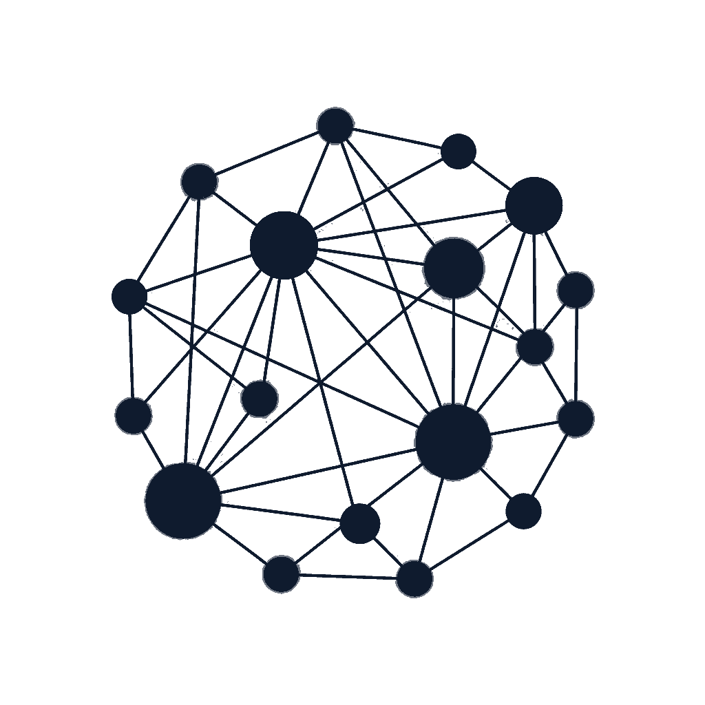
A network, not a logo. Dots in graduated sizes — every one connected, every one essential. The mark shows what Vitals is: an all-in-one app, drawn as the system itself.
01
why it fits Vitals
Three reasons. That's it.
01The mark is the product.
40+ tools, all connected, all in one install. The constellation shows that — not as a metaphor, as a diagram.
02Stands out in the App Store.
Every competitor is a gradient or a letterform. Vitals is a network. Instantly different on a page of thumbnails.
03Reads as serious software.
Considered, geometric, no decoration. Looks like an app you'd trust with 30,000 stores. Not a startup logo. A system mark.
02
the logo
Four lockups. Paper is canonical. Ink is the dark mode. Accent is reserved for campaign moments — never the default.
vitals
vitals
vitals
vitals
clear space
Padding around the mark equals the diameter of one large dot. No copy, no edge inside that.
never do
Don't rotate, don't change dot positions, don't add or remove dots, don't drop the lines. The connections are the brand.
scale floor
Below 56px, switch to the favicon mark (3 dots). The full constellation needs room to breathe.
03
the favicon
At 16px the full constellation collapses into noise. Strip it to its irreducible idea: three dots, connected. Same logic, fewer nodes.
Three is the smallest constellation possible.
Two dots make a line. Three make a system. Three is the minimum that still says "network". The favicon keeps the soul of the mark at 16px without becoming a smudge.
32 · 48 · 64
04
Shopify app icons
Shopify App Store thumbs are 1200×1200 served at ~80px. Ink is canonical — the rest are for ads, A/B tests, and campaigns.
Ink · canonical1200 · live listing
Paper · light context1200 · alt
White · formal1200 · print, embed
Glow · hero1200 · launch surfaces
Electric · campaign1200 · ads, drops
Accent on paper1200 · feature pages
Accent on ink1200 · AI surfaces
Soft paper · subtle1200 · onboarding
05
color palette
One palette. Four colors. Locked. Midnight is the brand from now on — every surface, every channel.
the palette
Midnight
Deep navy reads as serious & considered. Warm bone keeps it human, not corporate. Electric blue says intelligent system, not legacy SaaS. The neighborhood: Linear, Anthropic, Vercel — the apps merchants already trust for AI.
Ink#0F1B2E
Type, dark surfaces, app icon canonical
Paper#F4F0E8
Page background, logo on dark, default canvas
Accent#4F6BFF
CTA, links, AI surfaces, one moment per page
Stone#5B6478
Body copy, secondary text, dividers
accent rule
Use electric blue for one thing per page. The CTA, or the link, or the active state. Never two. The accent earns its weight by being rare.
paper-on-ink ratio
Most surfaces are paper-on-ink-typography. Hero panels and footers go ink-on-paper-typography. The contrast keeps both feeling deliberate.
do not introduce
No green, no orange, no purple, no warm browns. The palette is closed. If a surface needs another color, it's the wrong surface.
06
backgrounds & patterns
Six surfaces. All Midnight. Solid first, pattern last. The mark is already busy — backgrounds should make space, not compete.
01 · paper · default
Paper
The warm white the brand lives on. Body of every page.
02 · paper soft
Paper · soft
Slightly warmer, for cards and quiet sections.
03 · ink · serious
Ink
The dark canvas. Hero panels, footers, emphasis surfaces.
04 · ink · electric glow
Ink · electric glow
Soft blue radials in two corners. AI features, hero shots, app tile photography.
05 · accent · campaign
Accent
Pure electric. Use for one panel per campaign. Never two.
06 · constellation overlay
Constellation overlay
The mark itself, scaled large, faded to 10%. Decorative — never under copy.
why this pattern
The mark is the system. The overlay is that system, faded to a whisper.
A dot grid is geometry. It has no relationship to Vitals. The constellation is the brand — when merchants see the same shape faintly behind every hero, every email, every ad, the message is constant: this is one connected suite. Not 8 plugins glued together. Use only on hero panels and section breaks. Never under dense content.
07
typography
One family. Geist, set in three roles: display, body, and a mono accent for tags and labels. No serifs, no second face. The constellation is the ornament — type is the silence around it.
Vitals replaces six to eight Shopify apps with one. Reviews, upsells, replays, badges, AI tools — all in one place, no app conflicts, no slow store, real human support 24/7.
 vitals