
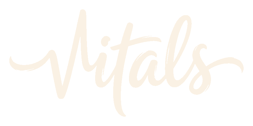
A hand-lettered signature, drawn in one gesture. Personal. Crafted. Confident. The opposite of generic SaaS — and the visual version of how Vitals already talks to merchants.
Why this fits Vitals
Vitals' voice is "a knowledgeable friend who runs a Shopify store" — warm, direct, helpful, never corporate. The brush mark draws that voice in ink. It's a signature, not a logo.
One word, written by hand. That's the whole identity.
Reads as human, not as software.
Hand-lettered = made by a person, for a person. Sets the tone before a single word of copy lands.
Stops the scroll without shouting.
The Shopify App Store is a wall of saturated gradients. A walnut signature on cream is the loudest move because it doesn't look like an app.
Signals craft, the way merchants describe Vitals.
"Vitals is vital." 2,600+ five-star reviews keep using words like reliable and solid. A signature mark backs that up — it looks made-with-care, not generated.
One mark does every job.
No separate logo + symbol. The wordmark scales from billboard to favicon (where it drops to just the V).
Logo lockups
Four canonical surfaces. The wordmark is locked — never re-typeset, never re-traced. It sits on cream, paper, walnut, or heat-orange. Nowhere else.
Favicon — only the V
At 32px the full wordmark stops reading. The favicon drops to just the V — the most distinctive single gesture in the wordmark. One tile, centered, walnut on cream.

One favicon. Centered. That's it.
The V is the wordmark's most recognizable single shape, so we don't need a different mark for small sizes — we use the same V already inside the signature. Walnut tile, cream V, 22% rounded corners (the Shopify / iOS standard).
Used for: browser tab, PWA tile, native app icon at small sizes, Slack avatar, GitHub avatar, anywhere the full wordmark won't read.
Shopify app icon — full signature
Unlike the favicon, the App Store tile is large enough to carry the full wordmark. Same four background colors as the lockups, in a 22%-rounded square. Pick a primary; the rest stay as variants for ads, marketing, and seasonal use.
Color palette
Five colors. Walnut and Butter Cream are the brand. Paper sits inside cream as the surface for cards and modals. Stone handles all body copy. Heat Orange is the single accent, reserved for the one thing that needs to shout.
Rule of thumb: Walnut, Cream, Paper, and Stone do 95% of the work. Heat Orange shows up only when something needs to be unmissable. If everything is orange, nothing is.
Backgrounds
Three surfaces. That's all the brush mark needs. Plain cream, plain walnut, and a subtle paper grain for moments that should feel printed, not rendered.
Typography
Two type families, one custom mark. Fraunces carries everything visible — display, headlines, body. JetBrains Mono stamps the technical accents. Nothing else. The brush wordmark stays a custom asset; it's never re-typeset.
Vitals Brush
Hand-lettered, drawn once, locked. Used as artwork, never as a font. Always pulled from the SVG/PNG master.
USE logo · favicon · app icon · hero
STATUS Vitals owned · do not redraw
Fraunces
Variable serif with optical sizing. Carries headlines (heavy, italic for emphasis) and body text (regular weight) without needing a second font.
BODY 400 · −0.005em · opsz 14
EMPHASIS 500 italic
One subscription.
JetBrains Mono
The technical voice. Stamps numbers, status, labels, eyebrows, system messages. Always uppercase, slightly tracked.
TRACKING +0.12em UPPER
USE labels · numbers · system stamps
2,600+ ★ REVIEWS
How it lives
Three surfaces. Each one says "all-in-one Shopify marketing app" in two seconds, with the brush brand layered on top. Same five colors, same two fonts, three different jobs.
40+ Shopify tools. One app.
Replace 6–8 marketing apps with one install. Reviews, upsells, replays, AI — natively integrated, zero conflicts.
Hey John — quick one before you launch the upsell. The new bundle template lives in the Upsells tab; should boost AOV around 12%.
Real humans on call if it doesn't behave.
@vitals